Strata Town
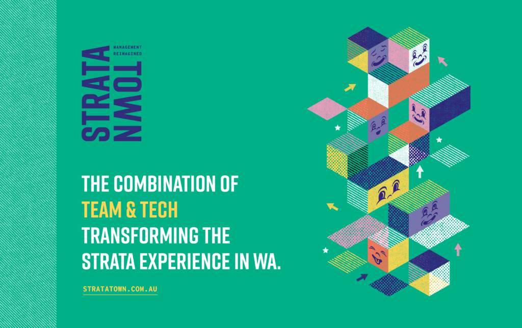
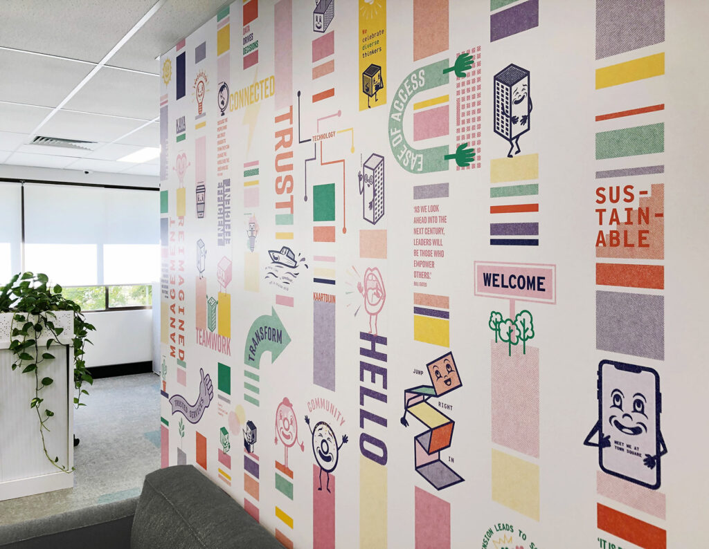
The rebrand brief for Strata Town was to challenge the ‘norm’ and the ‘it’s just always been like this’ attitude of traditional strata management. With a focus on custom-built tech paired with efficient customer service, they wanted to completely redefine customer experience in the strata-sphere and bring new energy to a ‘dinosaur industry’.
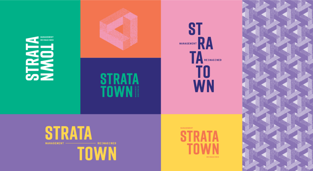
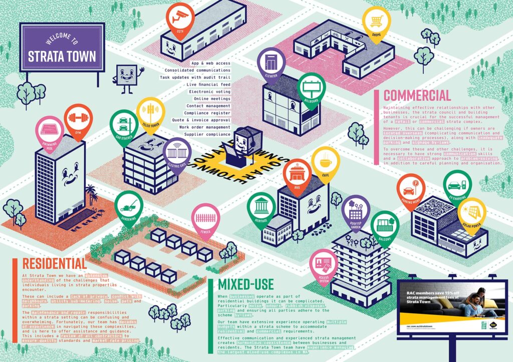
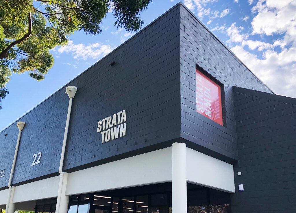
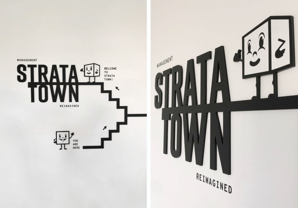
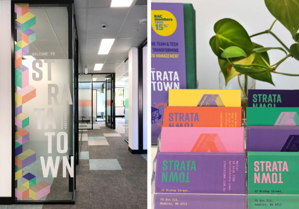
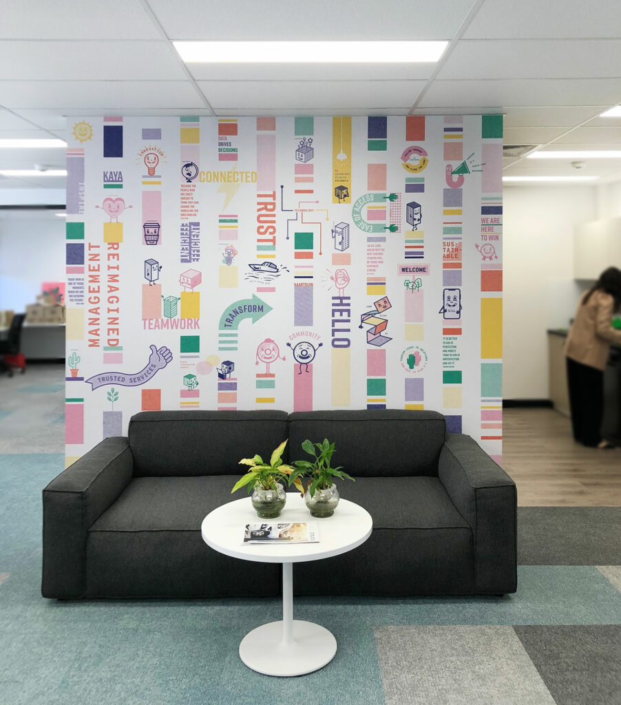
Strata Town required a visual identity that was bold, energetic, friendly, approachable and innovative. Stacked tall like a multi-level building complex, the typography is strong and bold. The brandmark has great flexibility – it can be used tall, wide, stacked and broken apart, easily adapting to multiple applications with ease. A multi-dimensional icon was developed to support the type, representing building blocks with a slight nod to tech.
Combined with a punchy colour palette, halftone textures and fun block graphics and illustrations, the visual identity for Strata Town speaks of how they are reimagining strata management.
. . . . .
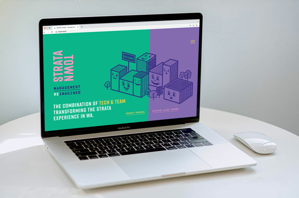
Website build: Kate Keiley Designs